
Engraved Stainless Steel Signs London
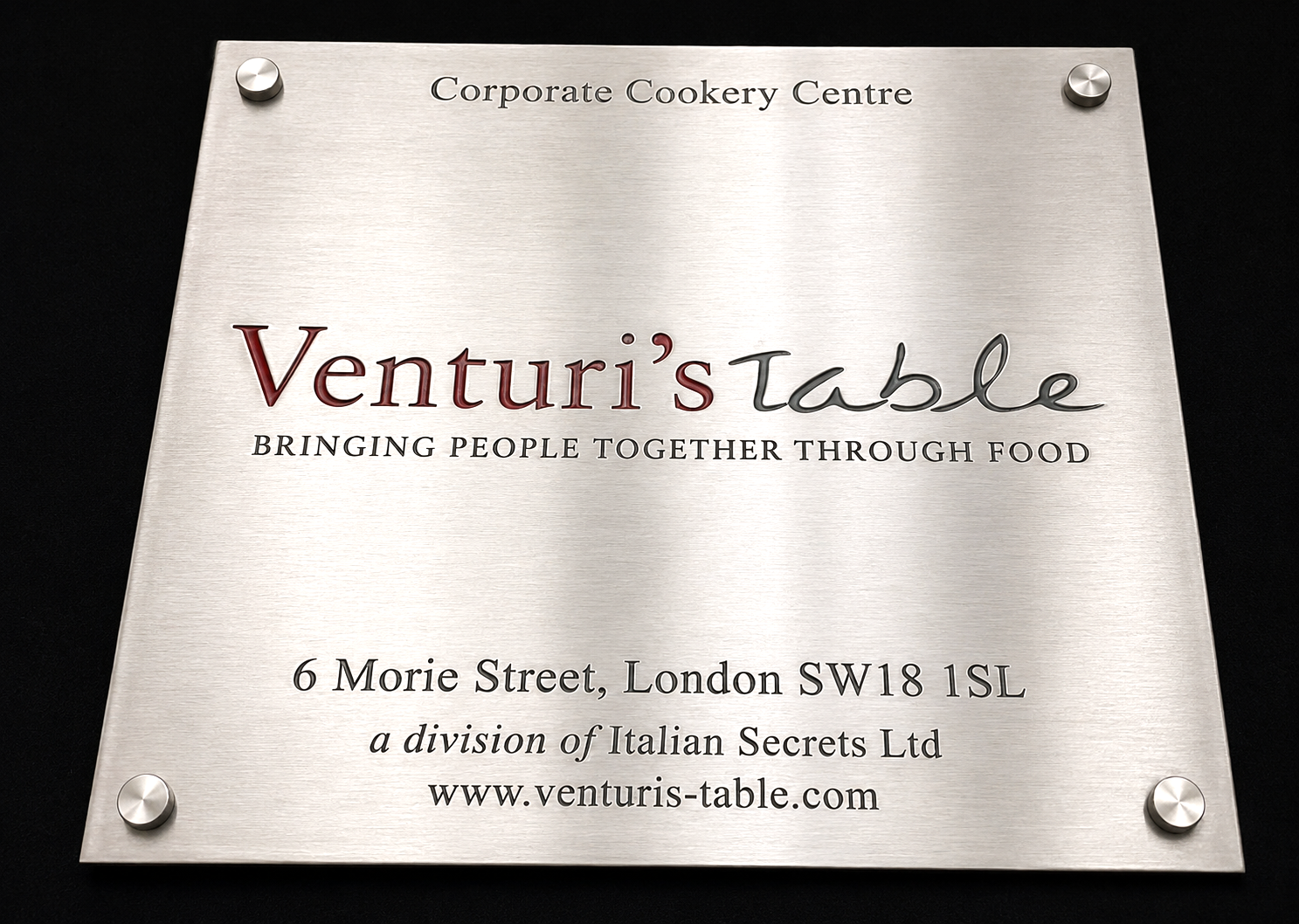
When durability matters as much as appearance, stainless steel is the professional choice. The clean, contemporary finish suits modern offices in Shoreditch, corporate headquarters in Canary Wharf, and any setting where you want signage that looks sharp year after year without maintenance. Unlike brass that needs periodic polishing, stainless steel simply wipes clean and carries on looking pristine.
At Premium Signs, we work exclusively with 316 marine grade stainless steel for our engraved plaques. This is the same grade used in coastal and marine applications, chosen for its exceptional resistance to corrosion, salt, and atmospheric pollution. For outdoor signs facing London weather, there is no better material.
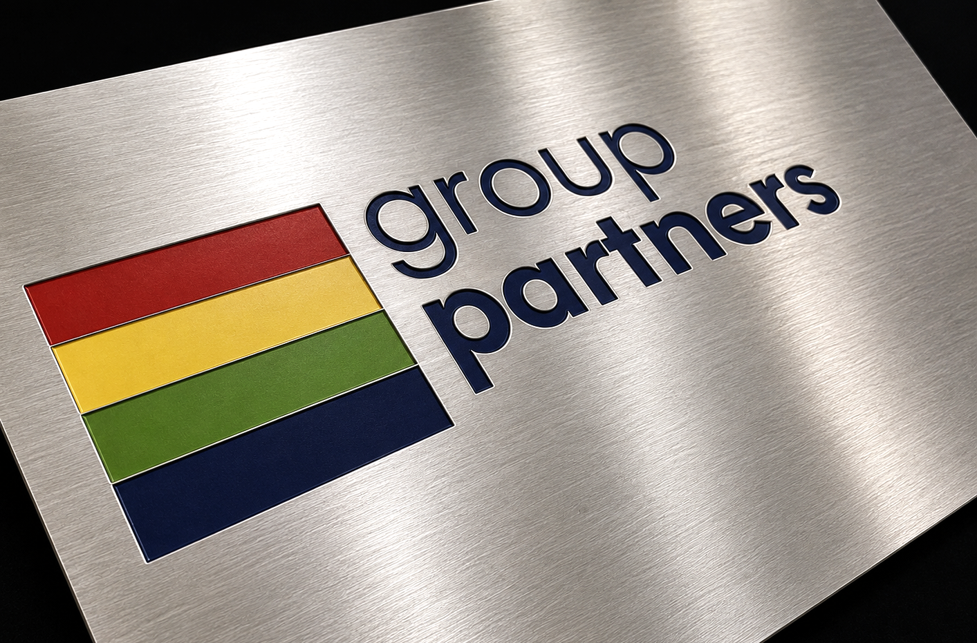

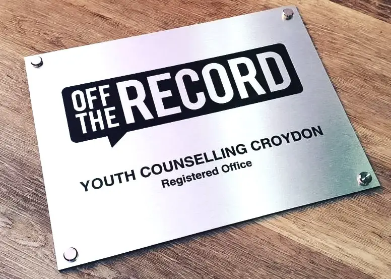
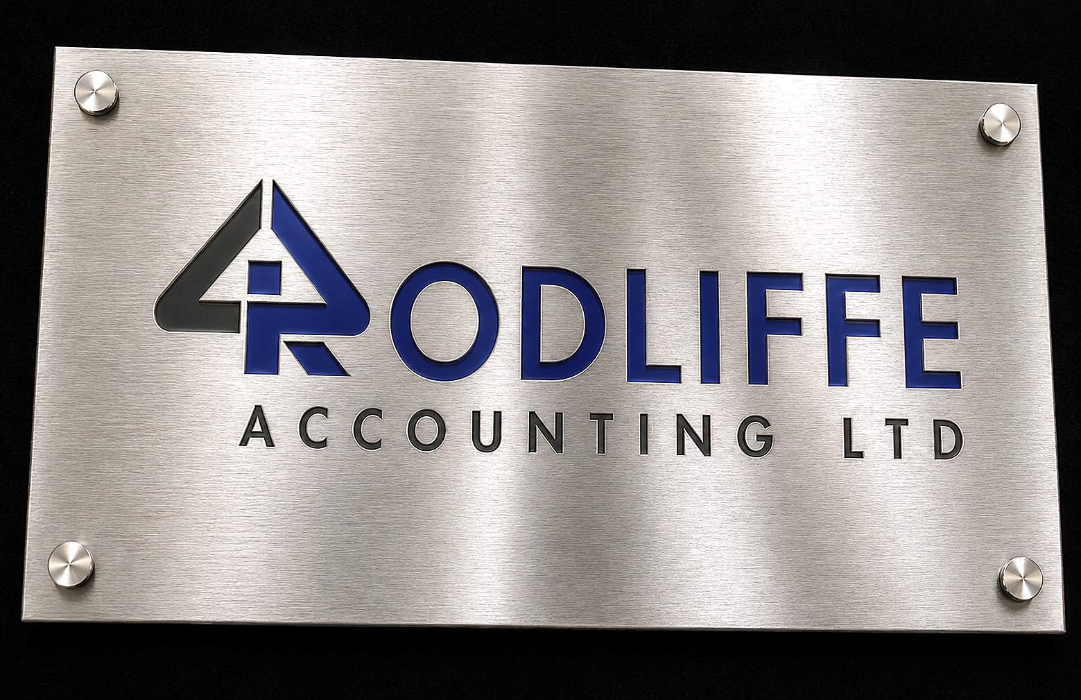
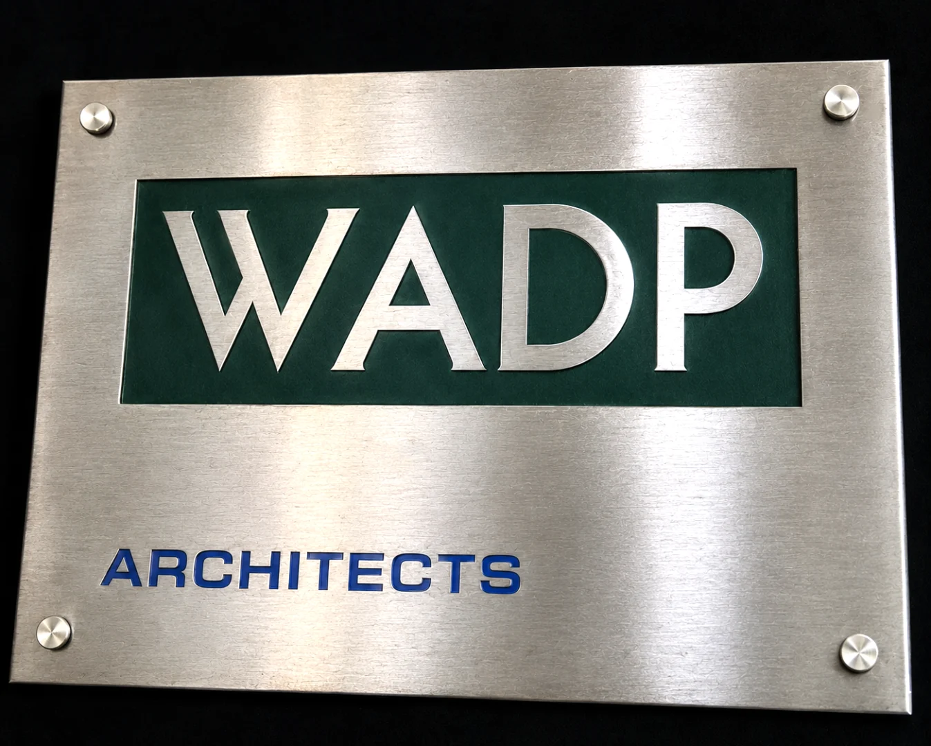
Why Choose Stainless Steel
Stainless steel offers practical advantages that make it ideal for demanding environments. The material will not rust, tarnish, or corrode, even when exposed to rain, pollution, and temperature extremes. Signs we installed twenty years ago still look as good as the day they went up. For busy commercial settings where nobody has time for maintenance, this matters.
The silver tone of stainless steel gives a distinctly modern, professional impression. It pairs naturally with glass, aluminium, and contemporary architecture. Where brass says “heritage and tradition,” stainless steel says “forward thinking and efficient.” Many tech companies, financial institutions, and healthcare facilities choose stainless for exactly this reason.
Grades and Finishes
We use 316 marine grade stainless steel as standard. This contains molybdenum, which provides superior resistance to chlorides and acidic environments compared to the more common 304 grade. For signs that will face coastal air, industrial atmospheres, or simply years of London rain, 316 grade gives you complete peace of mind.
Our stainless steel plaques are available in two main finishes. Brushed satin has a soft, directional grain that reduces reflections and hides minor scratches. This is our most popular finish for commercial signage. Polished mirror finish delivers maximum impact with its bright, reflective surface. It makes a statement but does show fingerprints more readily, so works best where the sign will not be frequently touched.
Engraving Methods
Stainless steel is harder than brass, which means it holds fine detail exceptionally well. We use laser technology to engrave text, logos, and artwork directly into the metal surface. The result is permanent marking that will never fade, peel, or wear away regardless of weather conditions or cleaning.
The engraved areas can be left natural, creating a subtle contrast against the brushed or polished background. Alternatively, we can infill with black, white, or coloured paint to make your design stand out more prominently. For corporate logos with specific brand colours, paint infill ensures your signage matches your identity exactly.
Common Applications
Stainless steel signs suit a wide range of commercial and institutional settings. We regularly supply:
- Corporate entrance signs and building identification for offices across London
- Professional nameplates for modern offices, clinics, and consultancies
- Memorial plaques for outdoor locations where maintenance access is limited
- Industrial signage for factories, warehouses, and production facilities
- Wayfinding and directional signs for building complexes and campuses
- Safety and compliance signage that must remain legible for years
Sizes
We manufacture stainless steel signs in virtually any size, from small desk nameplates at 150mm x 50mm up to large building signs at 1200mm x 600mm or beyond. Standard thickness is 1.5mm for most applications, with 3mm available for larger exterior signs that need extra rigidity.
Maintenance and Longevity
One of the biggest advantages of stainless steel is how little maintenance it requires. Unlike brass that needs polishing to prevent tarnishing, stainless steel stays bright with nothing more than an occasional wipe down. Use a soft cloth with water or a mild detergent to remove dirt and fingerprints. For stubborn marks, a stainless steel cleaner or even WD40 on a cloth works well.
With proper installation, a 316 grade stainless steel sign will last 20 years or more outdoors with no degradation. The engraving is permanent and will not wear away. This makes stainless an excellent investment for signage that needs to remain in place and legible for decades.
How to Order
Contact us with your requirements and we will provide a detailed quote. Let us know the size, what you want engraved, and whether the sign will be used indoors or outdoors. Our team can advise on the best finish and mounting options for your specific application.
Once you approve the quote, we create a digital proof showing your finished sign. Make any changes you need at this stage. When you are happy, we engrave and finish your sign at our Croydon workshop. Standard turnaround is around 8-10 working days. We deliver across London and throughout the UK.
Frequently Asked Questions
What is the difference between 304 and 316 stainless steel? 316 contains molybdenum, which provides better resistance to salt and corrosive environments. We use 316 marine grade as standard for all our signs to ensure maximum durability.
Will stainless steel rust outdoors? No. Marine grade 316 stainless steel is specifically designed to resist corrosion from rain, salt, and atmospheric pollution. It will remain rust free for decades.
Is stainless steel more expensive than brass? Slightly. A comparable stainless steel sign typically costs 10 to 20 percent more than brass. However, the zero maintenance requirement often makes it more economical over time.
Can you match my corporate brand colours? Yes. We can infill engraved areas with paint matched to your brand colours. Send us your Pantone or RAL reference and we will match it precisely.
Do you offer brass as an alternative? Yes. If you prefer a warmer, traditional look, see our engraved brass signs.
Related Services:
Engraved Signs | Metal Labels | Equipment Nameplates | Industrial Tags | Asset Tags | Aluminium Labels | Valve Tags | Brass Signs | Stainless Steel Signs
Engraved Brass Signs London
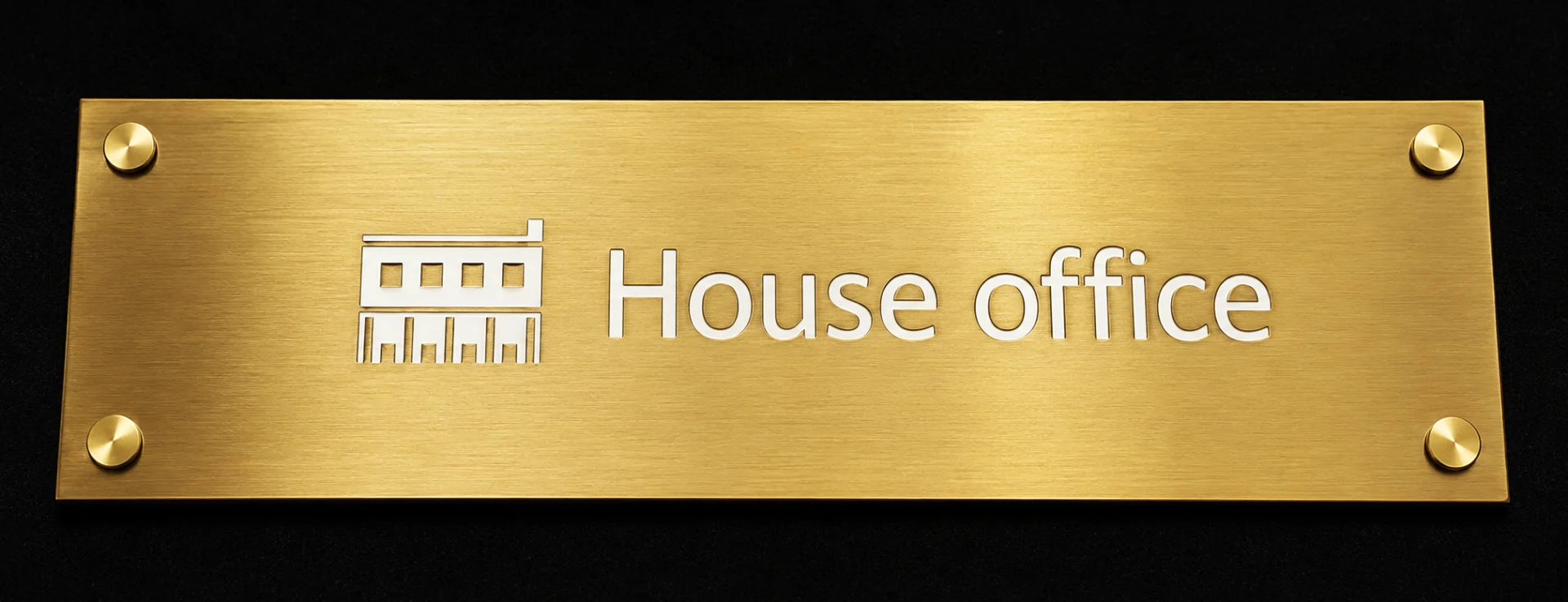
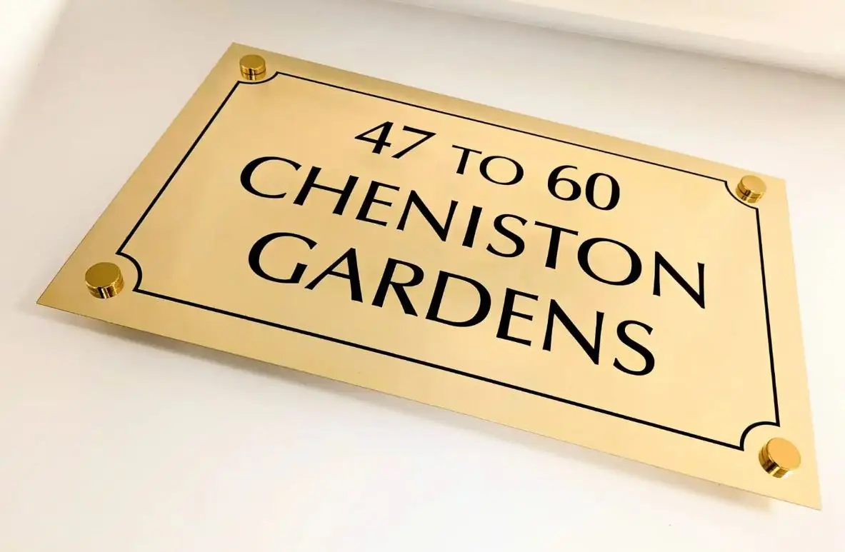
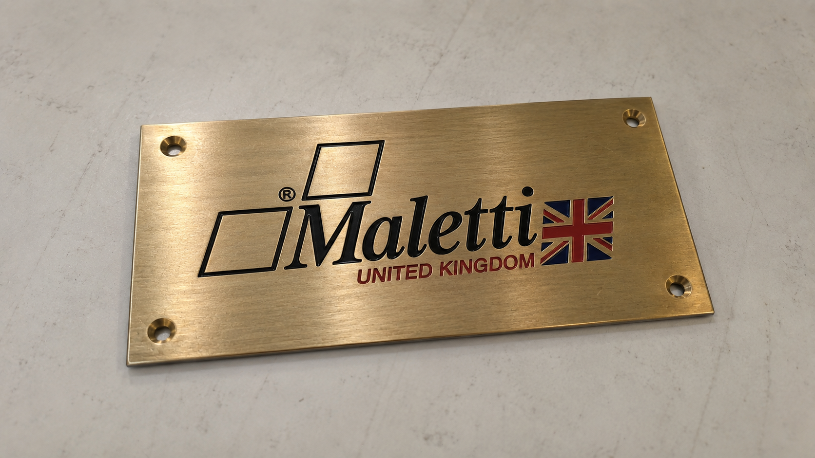
There is something about a brass sign that commands attention. The warm, golden finish catches the light and tells visitors they have arrived somewhere that takes pride in presentation. For solicitors in Holborn, medical practices in Harley Street, or heritage buildings across the City, an engraved brass plaque remains the mark of established professionalism.
At Premium Signs, we have been crafting bespoke brass signage from our Croydon workshop since the 1980s. Every plaque is deep engraved using precision laser technology, then hand finished to your choice of polished mirror or brushed satin. We work with solid brass sheet, not plated alternatives, so your sign will age gracefully and can be polished back to brilliance for decades to come.
Why Choose Brass for Your Signage
Brass has been the material of choice for professional signage since Victorian times, and with good reason. The alloy of copper and zinc creates a naturally warm colour that sits beautifully against brick, stone, or timber. Unlike painted signs that fade or vinyl that peels, an engraved brass plaque actually improves with age, developing a subtle patina that speaks of permanence and heritage.
We use high quality engravers brass, typically 1.5mm thick for standard plaques or 3mm for larger exterior signs. The material machines beautifully, holding fine detail in logos and text without burring or distortion. For outdoor applications across London, brass offers excellent corrosion resistance. Yes, it will tarnish over time if left unpolished, but many clients prefer this natural aging. A quick rub with Brasso restores the shine whenever you want it.
Finishes and Engraving Options
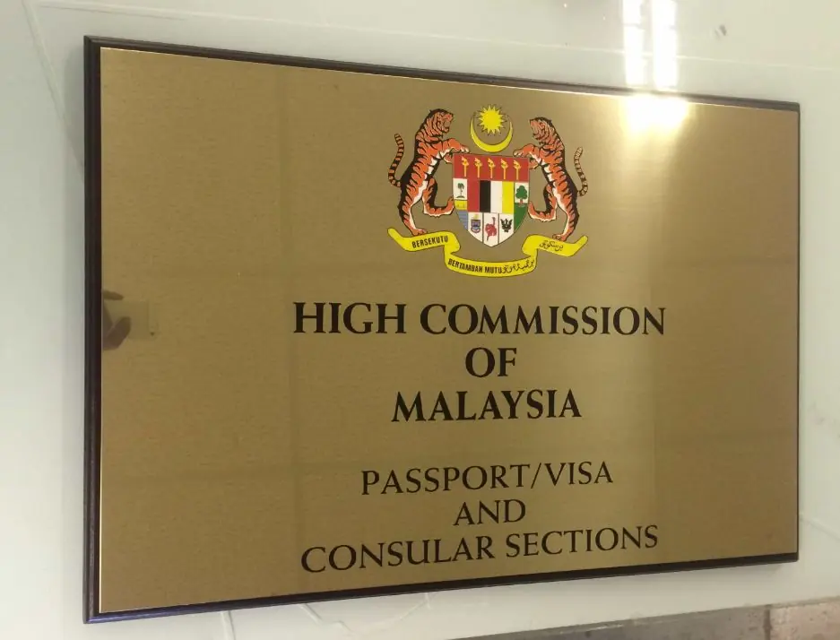
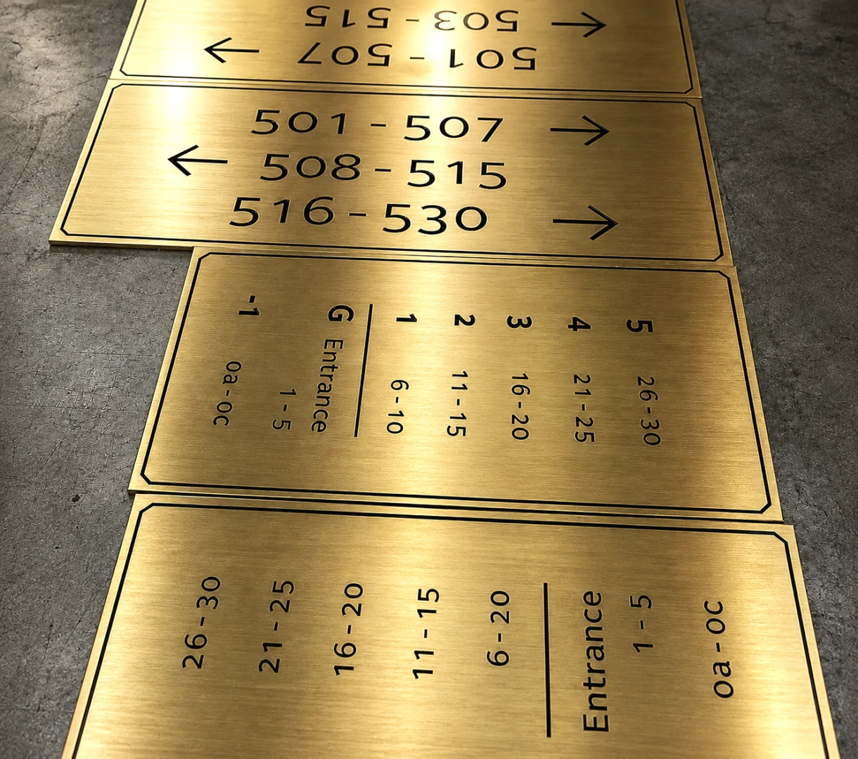
Your brass sign can be finished to match the character of your premises. Polished brass delivers that classic mirror shine, reflecting light and drawing the eye. It works brilliantly for traditional settings like law chambers, private members clubs, or period properties. Brushed brass offers a more understated elegance with its soft, directional grain. This finish shows fewer fingerprints and suits contemporary offices where you want warmth without the formality.
All our engraving is deep cut into the metal surface, not surface etched. This means your text and logos will remain legible even after years of polishing. We can infill the engraved areas with black, white, or colour matched paint to make your design stand out, or leave it natural for a subtle tone on tone effect. Logos, crests, and detailed artwork are all possible thanks to our precision laser equipment.
Popular Applications Across London
We supply engraved brass signs to businesses and organisations right across London. Some of the most common applications include:
- Professional nameplates for solicitors, accountants, and consultants in the City and Holborn
- Medical practice signs for Harley Street clinics and dental surgeries
- Memorial and dedication plaques for benches, buildings, and public spaces
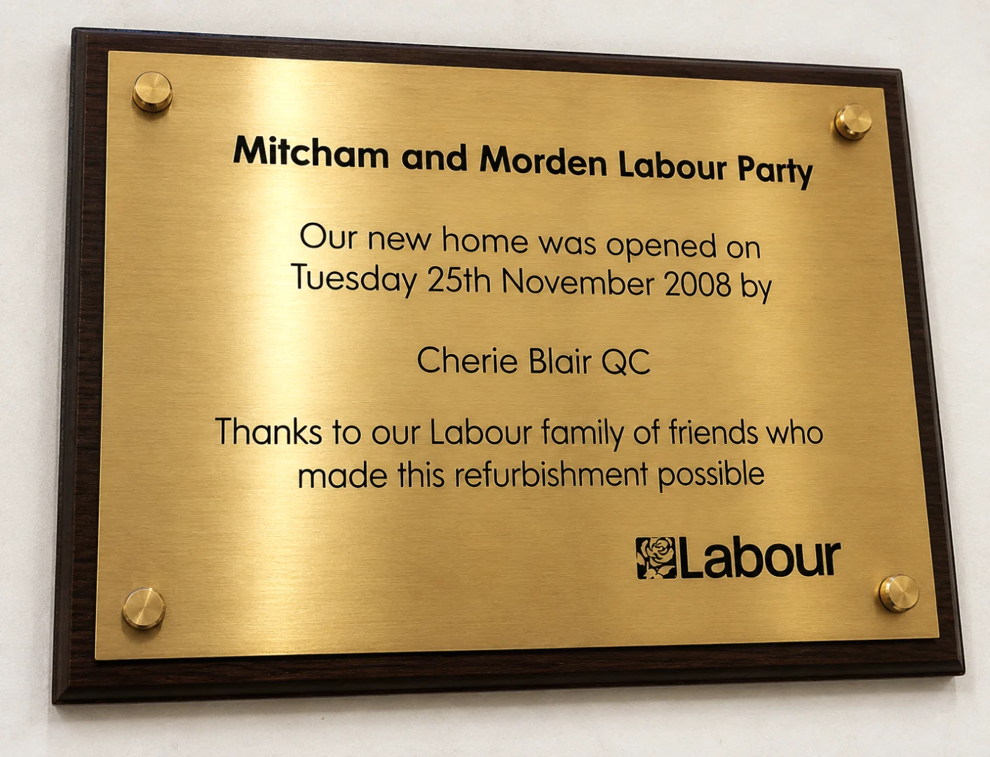
- Opening ceremony plaques for new facilities, unveiled by dignitaries or VIPs
- Door signs and room identification for hotels, clubs, and heritage properties
- Company registration plaques displaying business name and registration number
Sizes
Every brass sign we produce is made to your exact specifications. Standard rectangular plaques start from around 150mm x 50mm for small nameplates, up to 600mm x 400mm or larger for building signs. We can also cut curved corners, create oval or circular shapes, or produce completely bespoke outlines to match your branding. Custom sizes available up to 1m wide.
Caring for Your Brass Sign
Brass is a living material that responds to its environment. In London, where we get our fair share of rain and pollution, outdoor brass will gradually develop a darker patina. Many clients appreciate this aged character, particularly on heritage buildings. If you prefer to maintain the original shine, a periodic polish with a quality brass cleaner like Brasso will restore the lustre. Some clients apply a thin coat of clear lacquer or even a wipe of olive oil to slow the tarnishing process.
For indoor signs, maintenance is minimal. An occasional wipe with a soft cloth keeps the surface free from dust and fingerprints. The deep engraving means your text will never wear away, no matter how many times the sign is cleaned.
Our Process
Getting your brass sign made is straightforward. Send us your requirements by phone, email, or through our online form. Tell us the size you need, what text or logos you want engraved, and where the sign will be displayed. We will come back to you with a detailed quote and can advise on the best finish and thickness for your application.
Once you approve the quote, our design team creates a digital proof showing exactly how your finished sign will look. You can request changes at this stage at no extra cost. When you are happy, we engrave and finish your sign in our Croydon workshop. Standard turnaround is around 8-10 working days, with faster options available for urgent projects. We deliver across London and nationwide.
Frequently Asked Questions
Is brass suitable for outdoor use in London? Yes. Brass is naturally corrosion resistant and will last for decades outdoors. It will develop a patina over time, which can be polished off if you prefer the original shine.
Can you engrave logos and artwork? Absolutely. Our laser equipment can reproduce detailed logos, crests, and artwork with precision. Send us your files and we will show you a proof before production.
What mounting options are available? We can drill holes for screw fixing, supply adhesive pads for flat surfaces, or provide standoff fixings for a floating effect. We will advise on the best option for your wall type.
Do you offer stainless steel as an alternative? Yes. If you prefer a modern silver finish or need something completely maintenance free, see our engraved stainless steel signs.
Related Services:
Engraved Signs | Metal Labels | Equipment Nameplates | Industrial Tags | Asset Tags | Aluminium Labels | Valve Tags | Brass Signs | Stainless Steel Signs

The Visual Story of Look Fantastic’s Signage: From Salon Roots to Retail Elegance
The Salon Days: Practical and Professional (1978–1997)
Long before Look Fantastic became an e-commerce giant, it was part of the Crown Salon Group, a Sussex based business founded in 1978. The Crown Salon Group was all about professional haircare, running salons and training centers that served both stylists and clients. During this era, signage was entirely physical and rooted in the tactile world of salons. These signs were likely straightforward, designed to catch the eye of passersby while signaling expertise. Picture modest but elegant storefront signs with clean typography, probably serif fonts in neutral tones like black, white, or gold, to convey a sense of trust and quality. These early signs weren’t flashy; they didn’t need to be. They served a local audience, highlighting the salon’s role as a go to spot for professional haircare. The Crown Salon Group’s signage likely focused on clarity, with simple logos or nameplates that emphasised reliability over bold branding. This practical approach set the stage for Look Fantastic’s later focus on accessible yet premium aesthetics.
A New Chapter with THG: Sleek and Sophisticated Signage (2010–2020)
Digital signage took on greater importance as Look Fantastic’s website became a global destination. Banners, pop ups, and category headers adopted a clean, high end aesthetic, with high resolution product images and subtle accents like gold or pastel tones to evoke glamour. The signage was designed to guide customers effortlessly through the site’s vast catalog, with clear calls-to-action like “Shop Now” or “Discover More.” For international markets, localised websites featured translated signage, ensuring consistency while catering to diverse audiences. During this period, Look Fantastic also began experimenting with physical signage through temporary activations. For example, branded booths at beauty events or trade shows likely featured the logo prominently, paired with sleek product displays and interactive elements. These early physical signs maintained the brand’s digital aesthetic, clean lines, bold typography, and a focus on premium beauty, while hinting at its potential in the offline world.
The First Store: A Milestone in Physical Signage (2024)
In September 2024, Look Fantastic opened its first permanent store in Altrincham, Cheshire, marking a historic moment for its signage evolution. The store’s exterior signage is a bold statement: a large, illuminated Look Fantastic logo in crisp black against a sleek white backdrop, designed to stand out in Altrincham’s bustling high street. The minimalist design mirrors the brand’s online aesthetic, but its physical presence adds a new layer of gravitas, signaling Look Fantastic’s arrival as a brick and mortar player. Inside, the store’s signage is a masterclass in blending form and function. Product displays are accompanied by elegant signs with concise descriptions, using the brand’s signature typography to highlight brands like The White Company and Estée Lauder. Interactive digital screens serve as modern signage, showcasing tutorials and promotions while maintaining the clean, luxurious vibe. The store also features subtle wayfinding signs to guide customers through sections like skincare, haircare, and fragrance, ensuring a seamless shopping experience. The Altrincham store’s signage is designed to feel both exclusive and welcoming, with warm lighting and strategic placement that draws attention to curated products. It’s a far cry from the functional salon signs of the 1970s, reflecting Look Fantastic’s journey from local business to global beauty authority.

Beauty Packaging: The Secret Sauce Behind Influencer Hype and Discount Mania
In the dazzling world of beauty, packaging isn’t just a container, it’s a vibe, a statement, and a catalyst for viral moments. It’s the spark that lights up influencer feeds and makes discounts feel like the deal of the century. From holographic compacts to earthy bamboo jars, beauty packaging is rewriting the rules of engagement, turning products into cultural phenomena. This article uncovers how bold packaging designs ignite influencer obsession and turbocharge discount campaigns, weaving in fresh perspectives and industry trends.
Imagine a product that stops you mid scroll, a lip gloss in a crystal cut tube or a blush palette shaped like a seashell. Packaging is a brand’s chance to dazzle before a single swipe of product is applied. A 2023 Mintel report found that 55% of beauty consumers are swayed by packaging that feels “gift-worthy,” whether they’re shopping online or in a boutique. Brands like Too Faced, with its heart shaped bronzers, or Gucci Beauty, with its vintage inspired compacts, create instant desire. These designs don’t just sell, they dominate trending beauty finds on social platforms.
Brands lean into this by designing packaging that screams “one-time offer.” Think of MAC’s collaboration drops, with their graffiti splashed cases, or ColourPop’s zodiac themed palettes both perfect for discount-driven flash sales. These designs create a frenzy, especially when influencers share steal worthy beauty gems in their “haul” posts, sending followers racing to snag the deal before it vanishes.
Packaging also fuels influencer-driven discount hype. When a brand drops a promo code (e.g., “SPARKLE25” for 25% off), the product’s design takes center stage. A serum in a faceted glass bottle looks like a luxury splurge, even at a discount, making the deal feel like a no-brainer. Influencers amplify this by showcasing the packaging’s wow factor, turning their followers into eager shoppers.
Forget single-use plastics, today’s beauty packaging is doubling as decor and utility. Reusable designs, like magnetic palettes or keepsake tins, are stealing the spotlight. Brands like Besame Cosmetics, with its heirloom style compacts, or L’Occitane, with its refillable aluminum bottles, offer packaging that lives on as jewelry holders or vanity accents. A 2024 TikTok trend saw influencer
repurposing Charlotte Tilbury’s ornate cases as ring boxes, tying the post to a game changing beauty buys discount code.
This reusability trend resonates with influencers who love multi-purpose products. It also makes discounts feel like a bigger win, consumers aren’t just buying a cream; they’re investing in a keepsake. Packaging that doubles as a lifestyle accessory adds value, making it a hot topic in trending beauty finds.
When paired with discounts, emotionally resonant packaging becomes a call to action. Shoppers feel they’re buying into a story, not just a product. Clear packaging details, like vegan certifications or “made in small batches” labels, further deepen trust, encouraging purchases during sales and reinforcing the brand’s authenticity.
- Make It Art: Design packaging as a mini masterpiece, think sculptural shapes or hand painted motifs, to dominate influencer grids.
- Add Reusability: Create containers that double as decor or storage to boost perceived value and review appeal.
- Tap Into Culture: Weave storytelling or heritage into designs to connect with diverse audiences and spark emotional loyalty.
- Play With Texture: Use unexpected materials like cork or frosted glass to stand out in unboxing videos.
- Keep It Honest: Showcase ethical claims (e.g., cruelty-free or sustainable) on packaging to win over savvy shoppers.

Metalphoto® UK: The Gold Standard in Certified Durable Labels & Nameplates
Metalphoto® UK: The Gold Standard in Certified Durable Materials for Industrial Labels
Metalphoto® is the trademarked photosensitive anodised aluminium process recognised worldwide as the most durable printable material for permanent identification. Developed in the USA and specified by major organisations like NASA, Boeing, and the U.S. Navy, Metalphoto® embeds high resolution photographic images sealed inside sapphire hard anodic layers.
As a certified UK supplier, Premium Signs brings this gold standard technology to British industries, delivering custom labels, nameplates, and tags that withstand extreme abrasion, corrosion, chemicals, UV exposure, and temperatures up to 1,000°F.
Whether for defence compliance, aerospace, offshore marine assets, or heavy manufacturing, Metalphoto® ensures lifelong readability where other materials fail.
Ready to upgrade your identification? Request a Free Metalphoto® Quote below from our Croydon team today.
What Makes Metalphoto® the Most Durable Label Material?
The unique process seals black graphics (or colour options) within the aluminium, protecting them from surface damage:
- Archival Quality: Images won’t fade, scratch off, or degrade on our Aluminium labels.
- Photographic Resolution: Supports ultra-fine details, gradients, photos, and scannable barcodes/QR codes forever.
- Versatile Formats: Labels, tags, panels, equipment nameplates – with adhesive, holes, or custom shapes.
For standard durable options, explore our custom metal labels UK.
Proven Performance & Test Data
Independent testing confirms Metalphoto®’s superiority:
- Abrasion Resistance: Readable after 7,000+ Taber cycles (CS-17 wheel, 1,000g load).
- Corrosion/Salt Spray: No degradation after 720+ hours (5% salt spray) or seawater immersion.
- UV/Weather: No fading after 400-hour Weatherometer (equivalent to 20+ years outdoors).
- Temperature: Standard up to 500°F; XHT variant to 1,000°F.
- Chemical: Unaffected by fuels, solvents, acids, and hydraulic fluids.
Durability Comparison Table
| Feature | Metalphoto® Anodised Aluminium | Etched Stainless Steel | Plastic/Polycarbonate |
|---|---|---|---|
| Outdoor Lifespan | 20+ years | 10-15 years | 3-8 years |
| Abrasion Resistance | Superior (7,000+ cycles) | Good | Poor |
| Corrosion Resistance | Excellent | Excellent | Fair |
| Chemical Resistance | Superior | Excellent | Poor |
| Temperature Tolerance | Up to 1,000°F | Excellent | Limited |
| Barcode/QR Longevity | Permanent & scannable | Good | Fades |
| Variable Data Cost | Cost effective | Higher | Low |
Key Applications in UK Industries
Metalphoto® excels where reliability is critical:
- Aerospace Labelling & Defence → MIL-STD-130 compliant UID/barcode labels.
- Marine & Offshore → Corrosion-resistant plates for ships and platforms.
- Energy & Heavy Equipment → Durable tags for oil/gas and renewables.
- Manufacturing → Permanent asset tracking with barcodes .
Certifications & Standards
Metalphoto® meets rigorous specifications:
- MIL-STD-130N (UID marking)
- A-A-50271 Class 2/3
- MIL-DTL-15024G
- Boeing Process Specs
- NASA approved
FAQ
What is Metalphoto® and why is it called the gold standard? A patented process creating sealed in images for unmatched durability, proven superior in independent tests.
How long do Metalphoto® labels really last outdoors in the UK? Over 20 years with no fading or degradation, even in harsh British weather.
Can Metalphoto® include barcodes or QR codes? Yes, ultra high resolution ensures permanent scannability .
Is Metalphoto® available from UK suppliers? Yes! Premium Signs is your local certified provider.
How do I get Metalphoto® labels made? Simple, contact us for a free quote.
Explore our full range: Custom Metal Labels | Metal Asset Tags.
Related Services:
Engraved Signs | Metal Labels | Equipment Nameplates | Industrial Tags | Asset Tags | Aluminium Labels | Valve Tags | Brass Signs | Stainless Steel Signs

Beyond the Sign: Understanding the Visual Language of Business Signage
Signage is more than simply a means of advertising a business; it is an art form that can reflect a brand’s personality, attract customers, and create an unforgettable experience. In this article, we’ll look at business signage and how inventive organisations are utilising it to stand out in a congested marketplace.
The Psychology of Signage
First impressions are extremely important in business. Often, the first impression a consumer has of a business is through its signage. Signage has a tremendous impact on customer views and may communicate a brand’s personality, beliefs, and identity.
The psychology of colour, typography, and design choices in signs is an interesting topic. various colours elicit various emotions, which might impact how buyers view a brand. For example, red is frequently linked with enthusiasm, passion, and urgency, making it a popular colour for clearance sale signs. Blue, on the other hand, is generally associated with trust, dependability, and peacefulness, making it an appropriate colour for financial organisations.
Font selection is another critical component of signage psychology. Different font types may express various personalities and moods. For example, a strong, all-caps typeface may express strength and authority, but a handwritten script font may convey beauty and refinement.
Design components play an important influence in signage psychology. Customers’ perceptions of a brand can be influenced by its general layout, usage of white space, and visual components. For example, a clean and minimalist design may offer a feeling of simplicity and elegance, whilst a more complex and colourful design may represent inventiveness and playfulness.
There are several instances of firms that have effectively employed signage to communicate their brand identity. One such example is Apple. The company’s simple and elegant signage reflects its emphasis on simplicity, elegance, and cutting-edge technology. Another example is Starbucks. The coffee chain’s green and white colour scheme and hand-drawn logo evoke warmth, comfort, and familiarity.
Understanding the psychology of signage is critical for any business seeking to produce effective signage. Businesses may successfully express their brand identity and attract customers by taking into account the emotions and impressions that different colours, typefaces, and design components might elicit.
Interactive and Dynamic Signage
Businesses are continuously seeking for new methods to engage their customers. One such method is the use of interactive and dynamic signage. This incorporates touch displays, QR codes, and augmented reality, among other things.
Touchscreens are a common type of interactive signage. They let customers to interact with the signs in a more direct and engaging manner. For example, several restaurants use touch displays to let clients make orders and customise their meals. This not only simplifies the ordering procedure for consumers, but it also minimises the workload for restaurant employees.
QR codes are another type of interactive signage. Customers may scan a code with their smartphone to get further information or special discounts. For example, a retail business may place a QR code on a product display to give customers with more information about the product or to provide a special price.
Augmented reality is an advanced kind of interactive signage. It enables customers to engage with signs in a more immersive manner. A museum, for example, may utilise augmented reality to provide visitors with a more engaging experience while viewing exhibits.The advantages of interactive and dynamic signage are numerous. They may boost customer engagement and happiness while also providing businesses with vital insights about their consumers’ preferences and behaviours. However, there are some possible disadvantages to consider, such as the expense of implementation and maintenance, as well as the possibility of technological complications.
As a whole, interactive and dynamic signage enables businesses to provide more engaging and memorable experiences for their consumers. Understanding the possible benefits and cons allows businesses to make educated decisions about whether and how to use these technologies into their signage strategy.
Ethical Signage
As businesses grow more environmentally concerned, sustainable and eco-friendly signage is gaining popularity. Sustainable signage is intended to have the least environmental effect possible during its entire lifespan, from manufacturing to disposal.
There are several approaches to making signage more sustainable. One method is to utilise environmentally friendly products. For example, some firms use recycled or biodegradable materials for their signs. Another option is to utilise energy-efficient lighting, such as LEDs, which need less energy and last longer than standard lighting.
The advantages of sustainable signage are numerous. It may help firms decrease their environmental effect, resulting in financial savings and a better reputation. It may also attract ecologically aware shoppers.
However, there are some possible downsides to consider. Sustainable signage may be more expensive to create than standard signage. It can also be more difficult to dispose of, because some materials are not easily recyclable or biodegradable.
Sustainable signage enables businesses to lessen their environmental effect while appealing to environmentally concerned clients. Understanding the possible advantages and downsides allows organisations to make educated decisions about whether and how to implement sustainable signage into their strategy.
The Next Generation of Signage
The future of company signs seems promising, with a lot of intriguing innovations on the way. These include 3D printing, virtual reality, and holographic displays, which are all poised to transform the way businesses connect with their clients via signs.
3D printing is a technology that is already making an impact on the signs sector. Businesses may use this technology to develop specialised, sophisticated products that would be difficult or impossible to manufacture using standard methods. This not only allows for greater creativity and customisation, but it also enables the creation of more robust and long-lasting signs.
Virtual reality is yet another innovation that will have a huge influence on corporate signage. Virtual reality allows businesses to create immersive signage experiences that take clients to another planet. For example, a car dealership may employ virtual reality to let buyers experience what it’s like to drive a certain model.
Holographic displays are also expected to revolutionise company signage. These displays enable the development of eye-catching signage that appears to float in mid-air. This technology has already proven effective in advertising campaigns, and it is expected to become increasingly popular in company signs in the future.
These technologies have immense potential to shape the future of commercial signage. Businesses are finding new methods to communicate with their consumers and produce signage that is both informative and memorable. As these technologies evolve and become more accessible, we should expect to see even more imaginative and creative company signs.
Business signage is an ever-changing creative medium that constantly pushes the boundaries of creativity and innovation. By delving into the psychology of signage, the rise of interactive and dynamic signage, the importance of sustainability, and the future of signage technology, we can gain a better understanding of how signage shapes our perceptions of businesses and creates memorable experiences.


Maximising Marketing ROI with the Boston Matrix: A Guide to Advertising and Branding
Understanding the Boston Matrix: The Boston Matrix consists of four quadrants:
- Stars: High market growth rate and high relative market share
- Cash Cows: Low market growth rate and high relative market share
- Question Marks (also known as “Problem Child” or “Wildcat”): High market growth rate and low relative market share
- Dogs: Low market growth rate and low relative market share
Each quadrant represents a different level of investment and potential return on investment (ROI).
Applying the Boston Matrix to Advertising and Marketing:
- Stars: These products have a high market share in a growing market and require significant investment to maintain their position. For advertising and marketing, this means allocating a large portion of the budget to these products to ensure they continue to capture market share. According to a study by McKinsey & Company, companies that invest heavily in their star products see an average ROI of 18% (McKinsey & Company, 2023).
- Cash Cows: These products generate a significant amount of cash flow but have limited growth potential. In terms of advertising and marketing, it’s essential to maintain brand awareness and market share for cash cows while minimizing expenses. A study by Nielsen found that companies that maintain a strong brand presence for their cash cows see an average ROI of 12% (Nielsen, 2023).
- Question Marks: These products have high growth potential but require significant investment to capture market share. For advertising and marketing, it’s crucial to allocate resources to question marks to turn them into stars. According to a study by Gartner, companies that successfully transform question marks into stars see an average ROI of 25% (Gartner, 2023).
- Dogs: These products have low market share and growth potential and should be divested or discontinued. In terms of advertising and marketing, it’s essential to minimize expenses and focus on more promising products. A study by the Boston Consulting Group found that companies that divest or discontinue their dog products see an average ROI of 10% (Boston Consulting Group, 2023).
The Boston Matrix, is an effective tool for optimising organisations’ advertising, marketing, and branding initiatives. Companies that understand the location of each product in the matrix may better allocate resources and maximise their ROI. Real-world facts and statistics show the value of investing in star items, sustaining brand presence for cash cows, converting question marks to stars, and divesting or abandoning dog products. Companies that use the Boston Matrix in their marketing strategy may make more informed judgements and grow faster.
Strategic management in general, as well as The Boston Matrix can be studied in a book by Fred R. David and Forest R. David.
Developing a Cohesive Brand Identity: The Role of Colours, Fonts, and the Boston Matrix in Advertising and Marketing
When considering the Boston Matrix in terms of branding, colours, and typefaces, we may look at how these aspects might be utilised to distinguish a company’s products or business divisions within the matrix. For example, a corporation may use certain colours or typefaces to symbolise its “Stars” (high market share and high growth potential) items, while using alternative colours or fonts for its “Cash Cows” (low growth and high market share) or “Dogs” (low growth and low market share).
In addition, we may talk about how the Boston Matrix can help with branding and marketing decisions. For example, a corporation may devote greater resources to its “Stars” items, such as investing in new branding or marketing efforts to promote these products. On the other side, a corporation may decide to divest or stop its “Dogs” items, which might include rebranding or repositioning them.
The Boston Matrix may be a useful tool for organisations trying to optimise their branding, marketing, and advertising strategies, and knowing how colours, typefaces, and other branding aspects can be utilised to support these goals can provide firms with significant insights.
Other studies on the boston matrix can be found below:
- Online courses: Platforms like Coursera, edX, and LinkedIn Learning offer courses on strategic management, marketing, and business analysis that cover the Boston Matrix in detail.
- Books: There are many books on strategic management and marketing that include in-depth discussions of the Boston Matrix. Some examples include “Strategic Management: Concepts and Cases” by Fred R. David and “Marketing Management” by Philip Kotler and Kevin Lane Keller.
- Business journals and articles: Business journals like Harvard Business Review, McKinsey Quarterly, and The Economist often publish articles on strategic management and marketing that explore the Boston Matrix in depth.
- Consulting firms: Some consulting firms, like the Boston Consulting Group (BCG) itself, offer resources and training on the Boston Matrix and other strategic management tools.
- Online resources: Websites like Investopedia, The Balance, and Business News Daily provide in-depth articles and guides on the Boston Matrix and its applications.


The Psychology of Colour in Design: Leveraging Emotional Impact in Visual Communication
Colour is a powerful design tool that may elicit a variety of emotions and influence behaviour. The psychology of colour investigates how various hues and shades influence our perceptions, emotions, and behaviours. In this post, we’ll look at the intriguing world of colour psychology and how it may be used to produce effective visual messages.
Colours can influence our emotions, behaviours, and perceptions. According to research, individuals form snap judgements about things within 90 seconds after their initial glimpse, with up to 90% of these evaluations based solely on colour. This emphasises the importance of colour selection in design.
Different colours elicit various psychological and emotional responses in people. Red is commonly associated with intensity, passion, and urgency. It can also increase hunger, making it a popular choice in fast-food businesses. Blue is widely seen as peaceful and trustworthy, making it a popular choice for financial organisations. Green is connected with growth, health, and freshness, making it a popular colour for environmentally oriented brands.
Cultural and socioeconomic influences might also impact our colour associations. For example, while red is commonly associated with love and passion in Western cultures, it also represents luck and prosperity in many Eastern civilizations.
Using Colour Psychology in Design: When selecting colours, consider the feelings and associations you wish to convey. Here are a few tips: Understand your target audience’s cultural background. Choose colours that reflect the intended tone of your design. Use colour to create contrast and highlight crucial areas. Be aware of colour blindness and make sure your design is accessible to all users.
The psychology of colour is a fascinating area that can assist designers in creating effective visual messaging. Understanding the emotional impact of different colours and how they might influence behaviour allows you to build designs that connect with your audience on a deeper level.
The psychology of colour in design has been thoroughly researched, and there are numerous real-world examples and evidence to support its impact on emotions and behaviour. Here are some instances:
Red and Performance
A study by the University of Rochester found that exposure to the colour red can lead to improved performance in detail-oriented tasks, suggesting that red enhances focus and attention.
Source: The University of Rochester
Blue and Creativity
Research from the University of British Columbia found that exposure to the colour blue can lead to increased creativity. Participants in a blue room generated twice as many creative outputs as those in a red room.
Source: The University of British Columbia
Green and Relaxation
A study published in the journal Environmental Science & Technology found that participants who spent time in a green environment reported lower levels of stress and anxiety compared to those who spent time in a built urban environment.
Source: Environmental Science & Technology
Yellow and Happiness
Research from the University of Manchester found that exposure to the colour yellow can lead to increased levels of happiness and optimism.
Source: The University of Manchester
These studies provide real-world proof of how different colours can influence our emotions and behaviour, and they should be considered in visual design in both digital and physical displays such as website design and signage.
McDonald’s – The fast-food giant uses a combination of red and yellow in its branding. Red is known to stimulate appetite, while yellow is associated with happiness and cheerfulness. This combination is used to attract customers and create a sense of urgency.
Coca-Cola – The soft drink company uses red in its branding, which is associated with energy, passion, and excitement. This color choice is used to evoke feelings of happiness and joy, aligning with the brand’s message of refreshment and happiness.
Nike – The sportswear company uses black in its branding, which is associated with sophistication, elegance, and power. This color choice is used to convey a sense of style and luxury, aligning with the brand’s image of high-quality, fashionable sportswear.
Netflix – The streaming service uses red in its branding, which is associated with excitement, energy, and passion. This color choice is used to create a sense of urgency and excitement, encouraging viewers to watch more content.
Apple – The tech company uses white in its branding, which is associated with purity, simplicity, and modernity. This color choice is used to convey a sense of elegance and sophistication, aligning with the brand’s image of high-quality, innovative technology.

How Engraved Labels Are Transforming Marketing Strategies
Personalisation has emerged as an important driver of client engagement and loyalty. One unique way used by businesses to do this is the usage of etched labels. These customisable engraved labels, which may include a customer’s name, logo, or message, are proving to be a successful marketing tool. In this post, we will look at a case study that shows the influence of engraved labels on marketing success, as well as the data that backs up their performance.
Companies from a variety of sectors have employed engraved labels to improve their marketing strategy. Here are some instances of renowned firms that have used etched labels.
- Coca-Cola: Coca-Cola has a history of using personalized labels to engage with its customers. In 2011, the company launched the “Share a Coke” campaign, which featured popular names on the bottles. This initiative encouraged consumers to share a Coke with friends and family, increasing brand engagement and loyalty.
- Nike: Nike has used engraved labels on its products to provide a personalized touch. For instance, the company has offered custom engraving on Nike ID shoes, allowing customers to add their names or initials to the product. This not only enhances the product’s value but also strengthens the emotional connection between the brand and its customers.
- Apple: Apple has employed engraved labels on its products, particularly on the iPod and iPad. Customers can personalize their devices by adding their names or a short message during the purchasing process. This personalization adds a unique touch to the product and makes it more memorable for the consumer.
- Louis Vuitton: The luxury brand Louis Vuitton has used engraved labels on its products, such as handbags and luggage. These labels often feature the brand’s iconic logo and the product’s serial number, which serves as a mark of authenticity and exclusivity.
- Tiffany & Co.: Tiffany & Co. has utilized engraved labels on its jewelry pieces, including bracelets, necklaces, and rings. These labels typically feature the Tiffany & Co. logo, the metal type, and the product’s serial number. This not only adds a touch of elegance to the product but also helps in identifying and verifying the authenticity of the item.
These examples show how corporations might use engraved labels to improve their marketing efforts, increase brand engagement, and add a personal touch to their products.

Lessons for the FIFA 2026 World Cup: Avoiding Design and Marketing Failures
The FIFA World Cup, a worldwide athletic event that draws billions of viewers, will expand its scope in 2026, with an unprecedented 48 teams participating across Canada, Mexico, and the United States. As the excitement grows, it’s critical to reflect on previous tournaments to discover and correct design, branding, and marketing flaws. This article delves into the key takeaways from past World Cups, emphasizing on the importance of good signage, color schemes, and typography, and how these may be used to improve the experience for both spectators and participants.
Signage for Clear and Consistent Communication
A major issue that has plagued previous World Cups is a lack of clear and uniform signage. For example, at the 1999 World Orienteering Championships (WOC) in Scotland, signage was badly done, with the event’s and host country’s names displayed in various font sizes, making the event’s branding appear fragmented. In contrast, the 2024 WOC in Edinburgh chose a more unified approach, ensuring that the event’s name and host city were clearly featured in the same font size, therefore increasing exposure and awareness.
Colors: Balancing National Identity with Global Appeal
The use of colors in branding and marketing materials is critical to the World Cup’s success. The 2026 World Cup logo, which uses a monochrome color scheme of black, white, and gold, allows each host city to reflect its culture and geography in its own way. However, it is critical to create a balance between national identity and global reach. For example, using colors from a country’s flag, such as Kenya, might cause misunderstanding and dilute the event’s brand identity.
Fonts: legibility and consistency
Typography is another important part of World Cup branding that has been uneven in the past. The use of block letters and circus typefaces in the 2026 World Cup emblem may appear current, but they also reduce readability, particularly in signs and marketing materials. The 2024 WOC in Edinburgh, on the other hand, used a more classic and readable style, making the event’s name and host city clearly identifiable.
Marketing: preventing miscommunication and confusion
The marketing of the World Cup is a hard endeavor that needs clear and consistent messaging. Miscommunication and uncertainty must be avoided at the 2026 World Cup, which will have an extended structure and several host countries. For example, the misunderstanding around the Copa America and the 2026 World Cup emphasizes the significance of precise message and unique branding in avoiding misconceptions and ensuring a smooth and successful event.
The 2026 World Cup presents a unique chance to learn from previous design, branding, and marketing errors. By emphasizing clear and consistent signage, a balanced color palette that respects national identity and worldwide appeal, intelligible font, and successful marketing, the event may provide fans and participants with a memorable and engaging experience.
According to a recent survey, 60% of British Columbia citizens believe that hosting seven 2026 World Cup games at B.C. Place is not worthwhile. The cost of hosting has increased from an initial budget of $230 million to between $483 million and $581 million. This emphasizes the necessity of strong marketing and communication in ensuring that the event is perceived as a worthy investment by host towns.
In terms of branding, the FIFA World Cup 2026 branding is expected to be a game changer in sports marketing, setting new standards and boosting expectations for future events.
